Wednesday, March 24, 2010

Creating Interesting Slides

Let's start with a quick recap. We began our discussion with Finding Interesting Slides for Your Courses. The following week, we posed our 10 Questions to Ponder, and then used those questions in Finding Photos for Your Slides. Now we'll combine those images and the questions to create an engaging (hopefully) slideshow. For our purposes, we'll be using PowerPoint 2007 and free screen-shot tool Jing.

We start by inserting our downloaded images into PPT as individual slides - here's what that looks like in Slideshare - our "before" slides:


Here Kelly takes us through editing the slides for the first five questions.

Question 1: How do we support the changing role of teacher?


Question 2: What is the role of the teacher?


Question 3: How do we help students discover their passions?


Question 4: What is the essential learning that schools impart to students?


Question 5: What is the purpose of school?


Mike continues with the remaining questions:

Question 6: How do we adapt our curriculum to the technologies that kids are already using?


Question 6: How do we adapt our curriculum to the technologies that kids are already using? (cont'd)


Bonus Question: Do we risk kids becoming addicted to technology?


Bonus Question: Do we risk kids becoming addicted to technology?(cont'd)


Question 7: What does an educated person look like today?


Question 8: How do we change policy to support more flexible time and place learning?


Question 9: What are the essential practices of teachers in a system where students are learning outside of school?


Question 10: How do we ensure those without privilege have equal access to quality education and opportunity?


Finally, here are the "after" slides:


Sunday, March 21, 2010

Edward Tufte, Powerpoint, and Dead Kittens

We've talked about PowerPoint, Death by Powerpoint, and Professor Edward Tufte. Before we post our final set of PowerPoint slides for our 10 questions to ponder, here's a very timely (and funny) graphic that brings it all together.

tufte-wallpaper.png


via Mark Goetz via FlowingData via dataviz

Monday, March 15, 2010

Five Days

Are you troubled by students in your classes distracted by laptops, Facebook, iPods, cellphones, text messaging, and the Internet? You might want to try this novel approach from The University of Minnesota's Heather LaMarre - challenge your students to go a 5 days without media or gadgets. Do you think Mike could do it for one day?

Toughest college test: No cell phone, no Facebook
Heather LaMarre calls her students 'the wired generation.' The University of Minnesota professor sees that they don't listen to an iPod, talk on a cell phone or surf on a laptop -- they do all three at once. She reads articles about their numbness to technology and knows that if one e-mails her at 10:30 p.m. on a Saturday and she doesn't write back by 11:30, he'll freak out.

So she did something about it.

Last week's class assignment: Five days without media or gadgets that didn't exist before 1984.
[emphasis added - MQ/KP]

Tuesday, March 9, 2010

Einstein and Tagore

Do you remember Mike's faculty day presentation from Spring 2009? He started the presentation with this slide and this quote from Tagore.
tagore1.png

Later in the presentation, he showed a slide with Albert Einstein and the same quote on a chalkboard. The slide is not real - it was created using www.txt2pic.com. While this slide is fiction, Einstein referencing Tagore may not be that far-fetched. As the photos below show, Einstein and Tagore met in July of 1930 in Kaputh, India.
tagore2.png

RabindranathTagoreandAlbertEinstein.jpg

Einstein Tagore.jpg

rabbi.jpg

Einstein with Tagore via Pictures

Monday, March 8, 2010

Edward Tufte Presidential Appointment

This is very cool. We just referenced Professor Tufte in Avoid Death By PowerPoint - Respect Your Audience and today we learn that he's been appointed to the Recovery Independent Advisory Panel by President Obama. He's a great choice. Not only will he bring an objective, sensible perspective, but his expertise in information visualization will aid in explaining how the recovery stimulus funds are being used or mis-used.

Ask E.T.: Edward Tufte Presidential Appointment
President Obama announced his intent to appoint several individuals to serve on the Recovery Independent Advisory Panel. Their bios are below.

President Obama said, 'These impressive individuals will be valued additions to our team as we work to confront the challenges facing our nation. I look forward to working with them in the months and years to come.'

...

Edward Tufte, Appointee for Member, Recovery Independent Advisory Panel
Edward Tufte is Professor Emeritus of Political Science, Statistics, and Computer Science at Yale University. He wrote, designed, and self-published The Visual Display of Quantitative Information, Envisioning Information, Visual Explanations, and Beautiful Evidence, which have received 40 awards for content and design. He is a Fellow of the American Academy of Arts and Sciences, the Guggenheim Foundation, the Center for Advanced Study in the Behavioral Sciences, the Society for Technical Communication, and the American Statistical Association. He received his PhD in political Science from Yale University and BS and MS in statistics from Stanford University.


Via Daring Fireball.

Avoid Death By PowerPoint - Respect Your Audience

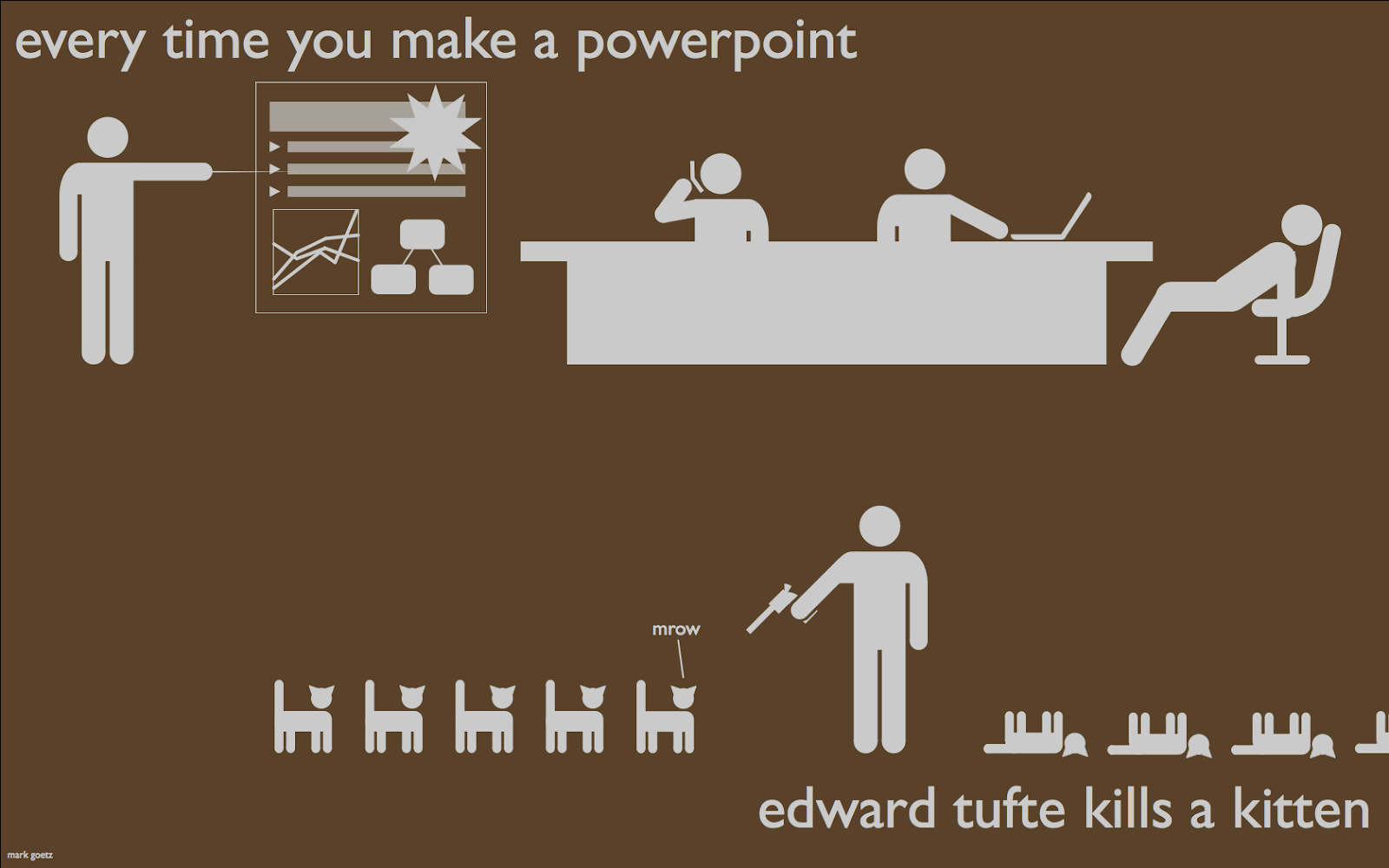
Many people have very strong - mostly negative - opinions about PowerPoint. The phrase "death by PowerPoint" has been used (maybe over-used) to describe the painful experience of sitting through a bad PowerPoint presentation. Let's begin with some thoughts from Edward R. Tufte - professor emeritus of political science, computer science and statistics, and graphic design at Yale. In a September 2003 Wired Magazine article PowerPoint is Evil Tufte illustrates his thesis with a really creative metaphor:
Imagine a widely used and expensive prescription drug that promised to make us beautiful but didn't. Instead the drug had frequent, serious side effects: It induced stupidity, turned everyone into bores, wasted time, and degraded the quality and credibility of communication. These side effects would rightly lead to a worldwide product recall.

Slideware may help speakers outline their talks, but convenience for the speaker can be punishing to both content and audience. The standard PowerPoint presentation elevates format over content, betraying an attitude of commercialism that turns everything into a sales pitch.
One could sum up the sentiment by borrowing and adapting a phrase from Security Consultant and blogger Steve Riley - PowerPoint is "... the place where knowledge goes to die."

While we don't disagree with Tufte and other critics that the use of PowerPoint is part of an ever-present misconception that technology fixes things or makes things better, we're not here to pile on--instead we'd like to offer some ideas to make PowerPoint more effective in your classroom. While technology can and has provided some great benefits to society, it's not a panacea - you can't just throw PowerPoint into the classroom and turn a poor lecturer into a good lecturer or a good lecturer into a great lecturer. Tufte gets it right when he says:
Presentations largely stand or fall on the quality, relevance, and integrity of the content. If your numbers are boring, then you've got the wrong numbers. If your words or images are not on point, making them dance in color won't make them relevant. Audience boredom is usually a content failure, not a decoration failure.
So how do we become better presenters? Most teachers would agree that there's no better way to learn how to do something than by watching and learning from people who are great at what they do, so we'd like to share with you today some interesting and innovative presentations that hopefully will inspire you to look at PowerPoint and technology in new and different ways. The first is the 2005 Open Source Convention keynote--Identity 2.0--from Sxip Identity founder and CEO Dick Hardt.

What's interesting and unique about this presentation is the style. In a presentation that lasts only 15 minutes, Hardt uses hundreds of slides--many with just a single word or image--to tell a story that is rapid-fire, humorous and engaging.

At the end of the presentation, Hardt credits Lawrence Lessig - Director of the Edmond J. Safra Foundation Center for Ethics at Harvard University, and a Professor of Law at Harvard Law School--for inspiring his presentation style. That said, here is example number two--Lawrence Lessig's presentation from the 2007 TED (Technology, Entertainment, Design) Conference. This is a shortened (20-minute) version of Lessig's Free Culture presentation.

What we can learn from Lessig (considered the master of the simple slide show) and Hardt is to break free from the constraints of PowerPoint--the titles and the bullet lists and the charts. Also consider how Lessig expertly weaves together humor, video, and storytelling to create his narrative and ultimately make his case.

The final example is Guy Kawasaki's Art of the Start speech at TiECon 2006 - the annual meeting of The Indus Entrepreneur organization. Kawasaki gives a great presentation about innovation and business evangelism, speaking plainly and peppering the presentation with humor.

Some of the key points Kawasaki makes are:
  • abandon the traditional business paradigm of Mission Statements in favor of shorter, more meaningful 3-4 word Mantras; and
  • adopt the 10/20/30 rule for presentations--no more than 10 content slides (Kawasaki favors top ten lists); no longer than 20 minutes (his presentation is nearly 40-minutes); and use nothing smaller than a 30 point font.
We really like the Mission versus Mantra discussion--it really parallels the Lessig/Hardt approach of simple is better. The 10/20/30 rule is interesting as well. While it may not work or be right for everyone, it does accomplish a few things--the 10 gets you and your audience to focus on 10 key points you'd like to get across (Mike uses takeaways); the 20 keeps the presentation short and digestible; and the 30 ensures that you HAVE to know what you're talking about--you can't read it off the slide, because it's not there.

We encourage you to watch and re-watch these videos and to try out some of what you see. Take one of your lectures and try the 10/20/30 rule or "simplify" it like Lesig and Hardt or come up with your own unique style. The key is to focus on the content and the learning and not get seduced by the technology, the animations, or the bullet lists. So, open up your mind, set aside your preconceptions; don't view PowerPoint as a crutch or as a substitute for your lecture, but instead as a spark that can ignite and excite an audience. And lastly, don't ignore Tufte's most important rule of speaking: Respect your audience.

Thursday, March 4, 2010

Powerful Presentations

Mark Shead at Productivity501 provides some tips for developing Powerful Presentations

Here are some of the principles I try to follow in creating presentations. Your mileage may vary, but this is what seems to work well for me.

Focus Attention

I like to use the visual presentation to focus people’s attention on what I’m saying and to help keep myself on track. If my slides make people stop listening to what I’m saying, they aren’t helping me. I keep my slides very clear–a white background and no header or footer. I’ve been debating whether or not I should add my company logo to each slide, but so far I’ve decided to leave it off in the interest of keeping everyone focused on what I’m talking about right then.

Minimal Words on Slides

Most of my slides contain a single word. A few contain a single sentence. This is very different than most presentations where the presenter seems to think they get paid more by fitting more words on a slide. My slide deck for a 60-minute presentation might be 50 to 70 slides long and only contain a total of 100 words.

...

Images

I use images where possible. Sometimes I use them in addition to a word on the slide and sometimes I simply use an image. For example, in a recent talk, I wanted to give an example from the management practices of a casino. I could have had a slide that said ‘Casino Example,’ but instead, I just used a photo of a slot machine. It helped get people’s attention and I don’t think adding text would have made it work any better. What I think would have been worse is to say ‘Casino Example’ and then try to fit a couple hundred words on the slide of what I planned to tell them in person.

...

Anchoring and Context

...

At the very beginning of a presentation, I like to lay out a general plan of what we are going to discuss. For example, the plan might be:

  • Introduction
  • Foundational Principles
  • Strategies
I actually do this before the introduction–before I’ve even really introduced myself or the topic if the audience already has an idea of the content. That way when I do the introduction and then move on to the next section, we have already established a pattern and expectations. In the example above, if I’m going to discuss 6 foundational principles, I will probably put a slide at the beginning listing all the the principles I want to cover, and then again at the end. That gives people an easy way to see exactly what is coming and helps bring closure to that topic by reviewing it before moving on to the next topic.

Monday, March 1, 2010

The State of the Internet or Why We Care About Web 2.0

Many of you - maybe your colleagues - may be wondering what all the fuss over the Internet is about, Web 2.0, Social Networking, etc. Why are we training faculty to teach online? Could it be the 1.73 billion Internet users worldwide? Why are young, energetic faculty like Dara Evans experimenting with Twitter and Facebook in their classes? Could it be the 50 million tweets per day? Or the 400 million people using Facebook? How about Facebook's 6 million page views per minute? Why the interest in podcasting and video? Hmmm ... 1 billion videos per day watched on YouTube - could that have something to do with it?

Think of these new tools not as replacements or substitutes for what you're already doing. Instead, think of these tools as the hot sauce or special sauce that spices up your lecture or your discussion.

Also worth a read is a recent report by the Pew Internet and American Life Project - The Future of the Internet.

Remarkable Stats on the State of the Internet
Individual stats like Facebook passing the 400 million user mark, Twitter hitting 50 million tweets per day, and YouTube viewers watching 1 billion videos per day are impressive on their own, but what if we looked at Internet-related stats collectively? Jesse Thomas did just that in his video State of the Internet.

The video — created and animated by Thomas with data from multiple sources — highlights some remarkable figures and visually depicts the Internet as we know it today. It’s a must-watch video for anyone trying to wrap their minds around just how immersed web technologies have become in our everyday lives.

You can watch the video below, but we’ve also included some of the most intriguing figures shared in the video:
  • There are 1.73 billion Internet users worldwide as of September 2009.
  • There are 1.4 billion e-mail users worldwide, and on average we collectively send 247 billion e-mails per day. Unfortunately 200 billion of those are spam e-mails.
  • As of December 2009, there are 234 million websites.
  • Facebook gets 260 billion pageviews per month, which equals 6 million page views per minute and 37.4 trillion pageviews in a year.

Photo by Trois TĂȘtes (TT)

Followers